The air quality looks even worse from space.
Yesterday, NASA released a visualization of Earth showing all the aerosols we are currently breathing in. In order to create this image of aerosol plumes, a variety of satellites and sensors were used.
According to NASA, aerosols are specks of solids and liquids that drift through the air. These particles become visible when smoke billows from a wildfire or when dust blows in the wind.
The image shown below was taken on Aug. 24. 2018.
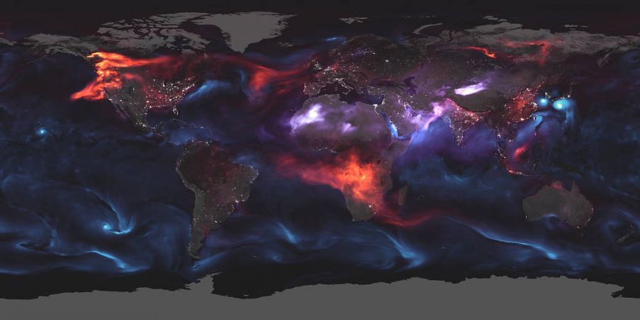
The released map shows places either being affected with an orange, purple or blue hue.
The blue and purple hues represent giant swirls of sea salt and dust while the red hue represents particles emitted by fires.
As you can see from the map, Canada, especially the west coast, is seeing some of the brightest red and orange hues.
This image is particularly significant because of our current wildfire crisis. There are currently hundreds of fires burning throughout the province with over 60 of them being ones of note.
This visualization really puts into perspective how many wildfires we have in our province and how much fine aerosol matter we are breathing in.


